
Your farm website is often the first place customers go to learn what you sell, where you are, and how they can buy from you.
This guide is for farms, CSAs, ranches, farm stores, market gardeners, agritourism businesses, and local food producers who want their website to do more than look nice. It should help customers take action.
In this article, we'll walk through the most common farm website design mistakes, why they hurt trust or sales, and how to fix them with practical improvements.
Key takeaways
- Your farm website should answer three questions quickly: what you sell, where you sell it, and how customers can buy.
- Good design starts with the customer journey, not just the farm story.
- Mobile design, page speed, accessibility, and clear calls to action all affect whether visitors become customers.
- Product pages need clear pricing, availability, photos, pickup details, and ordering instructions.
- Your website works best when it connects to your sales workflow, including inventory, ordering, customer communication, and fulfillment.
1. Designing around your farm story instead of the customer journey
Your story matters. Customers want to know who grows their food, how you farm, and why your products are different.
But if your website leads only with story, visitors may struggle to find the practical information they came for.
Most farm website visitors are trying to answer questions like:
- What products are available?
- Are you near me?
- Do you offer pickup, delivery, shipping, or markets?
- Can I order online?
- How do I join the CSA?
- Do you sell wholesale?
- What are your hours or ordering deadlines?
A strong farm website connects story with action. The homepage should quickly explain what you sell, who you serve, and what the customer should do next.
How to fix it
Use your homepage to create a clear path:
- Start with a specific headline.
- Show your main products or services.
- Include your location or service area.
- Link to your most important action, such as ordering, CSA signup, market schedule, or wholesale inquiry.
- Add your story after the customer understands the basics.
Tip: A homepage headline like "Pasture-raised beef and pork for families in central Alberta" is more useful than "Welcome to our family farm." For more guidance on structuring a homepage that converts, see farm website design.
2. Hiding what your farm actually sells
One of the biggest farm website design mistakes is making customers work too hard to understand your offer.
Beautiful photos and warm storytelling are useful, but they cannot replace clear product information. If a visitor has to click through several pages to learn whether you sell vegetables, meat, flowers, dairy, eggs, or events, the site is creating friction.
Common signs this is happening
- The homepage uses broad language like "local food" without naming products.
- Product categories are buried in dropdown menus.
- Seasonal products are not clearly marked.
- CSA, farm store, wholesale, and market options are mixed together without explanation.
- There is no obvious "Shop" or "Order" button.
How to fix it
Make your products visible early:
- List your core categories near the top of the homepage.
- Use plain labels like "Vegetables," "Pasture-raised chicken," "CSA shares," or "Farm tours."
- Add a short explanation of how each sales channel works.
- Link each category to a dedicated page or product collection.
This helps customers understand your farm quickly and choose the right next step. For tips on the copy itself, see how to write product descriptions that sell.
3. Making navigation too complicated
Farm businesses often serve different customer types: retail shoppers, CSA members, wholesale buyers, market customers, restaurant buyers, and visitors.
That can make navigation messy if every audience, product, and announcement gets its own menu item.
Simple navigation helps customers move faster. It also makes your website easier to manage as your farm changes through the season.
Navigation mistakes to avoid
- Too many top-level menu items.
- Unclear labels like "Programs" or "Offerings."
- Important pages hidden in dropdown menus.
- Different navigation on desktop and mobile.
- No direct link to ordering or contact information.
A clearer farm website menu
A practical farm website navigation could include:
- Home
- Shop
- CSA
- Wholesale
- Visit
- About
- Contact
Not every farm needs all of these pages. The goal is to organize the site around how customers actually buy from you.
Tip: If online ordering is a major part of your sales, "Shop" should be one of the easiest links to find.
4. Ignoring mobile design
Many customers will visit your farm website from a phone. They may be checking pickup details in the car, placing an order after seeing your market post, or looking up your address before visiting.
If your mobile site is hard to use, you may lose orders even if the desktop site looks polished.
Mobile design problems to check
- Text is too small to read comfortably.
- Buttons are hard to tap.
- The menu is difficult to open or close.
- Product photos push important details too far down the page.
- Checkout forms are frustrating on a phone.
- Pickup locations, hours, or deadlines are hard to find.
How to improve mobile usability
- Use large, clear buttons.
- Keep paragraphs short.
- Make phone numbers and addresses clickable.
- Test forms and checkout on a real phone.
- Keep key actions near the top of the page.
- Avoid pop-ups that block the screen.
Mobile design is not just about shrinking the desktop version. It is about helping customers complete common tasks quickly on a smaller screen.
Learn more about how to prep your farm's website for sales conversions.
5. Letting slow pages hurt orders
Farm websites often rely on large images. That makes sense because customers want to see your products, fields, animals, team, and pickup experience.
But oversized images, too many videos, and heavy design elements can slow the site down. Slow pages are especially frustrating for mobile shoppers.
What causes slow farm websites
- Full-size image files uploaded directly from a camera.
- Too many large photos on one page.
- Background videos that load automatically.
- Unused apps, plugins, or scripts.
- Product pages with too many uncompressed images.
How to fix it
Start with the highest-impact improvements:
- Compress images before uploading.
- Use only the strongest photos on each page.
- Avoid autoplay videos on key shopping pages.
- Test the site on mobile data, not just Wi-Fi.
- Keep checkout and product pages lightweight.
Page speed affects both customer experience and SEO. A faster site makes it easier for customers to browse, order, and return.
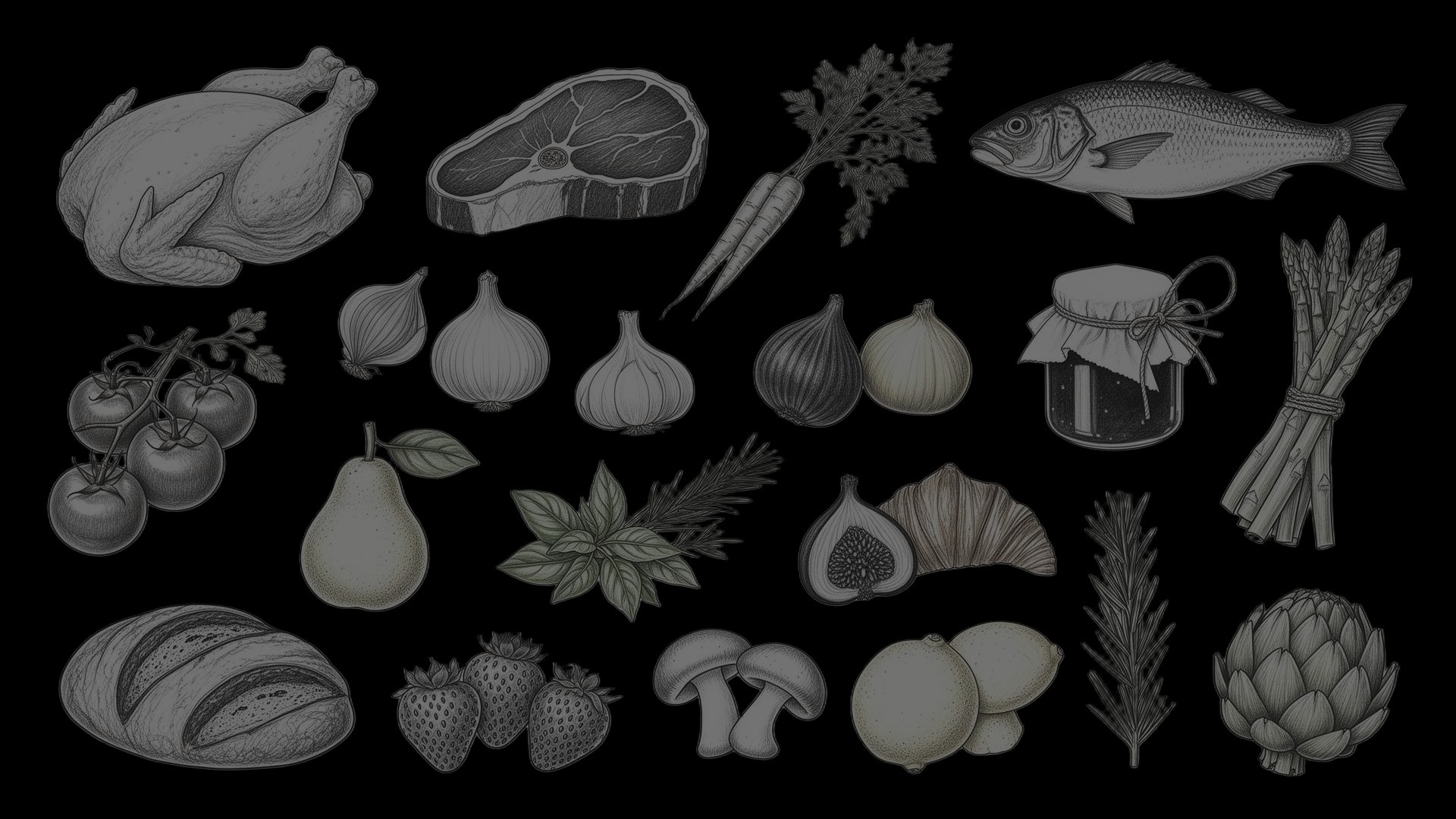
6. Using weak or generic visuals
Farm websites need real visuals. Generic stock photos can make the business feel less trustworthy, especially when customers are deciding whether to buy food from you.
The best visuals show what customers will actually experience.
Better images to use
- Your products after harvest or packing.
- CSA boxes or farm store displays.
- Animals, fields, greenhouses, or production areas.
- Your team at work.
- Pickup locations or market booths.
- Finished meals or product use examples.
Visual mistakes to avoid
- Dark, blurry, or outdated photos.
- Stock images that do not match your farm.
- Product photos with no sense of size or packaging.
- Images that look good but do not help customers decide.
- Too many photos competing for attention.
For product pages, clarity matters more than artistry. Customers want to know what they are buying, how much they are getting, and what condition it will arrive in.
For a deeper look at this, see our guide to product photos for your online farm store.
7. Creating product pages that do not help customers buy
A product page should answer the questions a customer would ask at a farm stand, market table, or store counter.
If those details are missing, customers may hesitate, abandon the order, or contact you with questions that the page should have answered.
Product page mistakes to avoid
- Missing prices.
- No package size or weight.
- Unclear availability.
- Poor product photos.
- No pickup, delivery, or shipping details.
- No storage, preparation, or use suggestions.
- No clear add-to-cart or inquiry button.
What to include on farm product pages
Each product page should include:
- Product name.
- Price and unit size.
- Clear product photo.
- Short description.
- Availability or seasonality.
- Pickup, delivery, or shipping options.
- Storage or preparation notes when helpful.
- Clear order button.
For more on writing the descriptions themselves, see our guide to farm product descriptions.
Tip: Using Local Line, you can manage products, pricing, inventory, and order details in one place. This helps customers see accurate information while reducing manual updates for your team.
8. Forgetting accessibility and readability
Accessibility helps more people use your website. It also improves the experience for customers on phones, older customers, customers with disabilities, and anyone trying to order quickly.
A website can look attractive and still be hard to use if the text is difficult to read or the design depends too much on visuals alone.
Accessibility mistakes to avoid
- Low contrast between text and background.
- Small font sizes.
- Images without alt text.
- Buttons that are hard to identify.
- Forms that are difficult to complete.
- Links labeled only as "click here."
- Pages that cannot be navigated easily with a keyboard.
Simple improvements
- Use readable fonts and strong contrast.
- Write descriptive link text.
- Add alt text to important images.
- Use clear form labels.
- Keep buttons visually distinct.
- Avoid placing text over busy photos.
Accessibility is not only a technical requirement. It is part of good customer service.
9. Using unclear calls to action
A call to action tells the visitor what to do next. On a farm website, that next step might be buying a product, joining a CSA, requesting wholesale pricing, booking a visit, or checking market dates.
Weak calls to action create uncertainty. Clear CTAs reduce it.
Weak CTA examples
- Learn more
- Click here
- Submit
- Get started
- More info
Better CTA examples for farm websites
- Shop this week's harvest
- Join the CSA
- View pickup locations
- Request wholesale pricing
- Reserve a farm tour
- Contact the farm
- See market schedule
Where to place CTAs
Add calls to action in natural decision points:
- Near the top of the homepage.
- After explaining your main products.
- On each product or category page.
- At the end of CSA and wholesale pages.
- In the footer for returning visitors.
A good CTA should match the page. A CSA page should lead to signup or the waitlist. A wholesale page should lead to pricing, account creation, or an inquiry form.
10. Overusing pop-ups, banners, and announcements
Farm websites often need seasonal announcements. You may need to promote CSA deadlines, holiday ordering, market changes, delivery updates, or new product drops.
The mistake is letting announcements block the customer from doing what they came to do.
Intrusive design problems
- Pop-ups appearing immediately when the page loads.
- Multiple banners competing for attention.
- Newsletter forms covering product pages.
- Pop-ups that are hard to close on mobile.
- Flashy announcements that distract from ordering.
How to use announcements better
- Use one clear announcement at a time.
- Keep banners short.
- Make pop-ups easy to close.
- Avoid blocking checkout or product browsing.
- Link announcements to a useful page.
Seasonal updates are valuable, but they should guide customers rather than interrupt them.
11. Publishing vague content
Vague content weakens design, SEO (Search Engine Optimization) and GEO (Generative Engine Optimization). If your copy is too broad, customers cannot tell what makes your farm relevant to them.
Specific content helps visitors understand your products, process, location, and buying options.
Vague content examples
- "We provide high-quality local food."
- "Our farm is committed to excellence."
- "We offer fresh products for everyone."
- "Contact us for more information."
These statements are not wrong, but they are not specific enough to help customers act.
Stronger farm website copy
Use details customers care about:
- "Certified organic vegetables available through weekly CSA pickup in Guelph."
- "Pasture-raised beef boxes for families across southern Ontario."
- "Wholesale microgreens delivered to restaurants every Tuesday and Friday."
- "U-pick flowers open from July through September by reservation."
Specific copy also helps search engines understand what your site should rank for.
12. Skipping basic farm website SEO
A beautiful farm website still needs to be findable. SEO helps customers discover your farm when they search for products, CSAs, local food, farm stores, or wholesale suppliers in your area.
Farm website SEO should be practical and location-specific.
SEO mistakes to avoid
- No location keywords.
- Missing page titles or meta descriptions.
- Thin product or category pages.
- No dedicated pages for CSA, wholesale, or farm store.
- Images without descriptive alt text.
- No FAQ content.
- Outdated seasonal pages.
Farm website SEO basics
- Include your city, region, and service area.
- Create separate pages for major sales channels.
- Use descriptive headings.
- Add useful FAQs.
- Write product and category descriptions.
- Keep seasonal information current.
For example, a vegetable farm that sells CSA shares should have a dedicated CSA page, not just a short mention on the homepage. That page can answer questions about pickup, share size, pricing, schedule, customization, and signup deadlines.
13. Separating your website from your sales workflow
A farm website should not be separate from the way you sell. If the site says one thing, your order forms say another, and your emails say something else, customers become confused.
This also creates more manual work for your team.
Signs your website and workflow are disconnected
- Products are listed online but no longer available.
- Customers ask the same pickup questions every week.
- Staff manually update inventory in multiple places.
- Wholesale buyers use a separate process from retail customers.
- Order confirmations do not match fulfillment details.
- Customers are unsure whether their order was received.
How to connect the workflow
Your website should support the full buying process:
- Product browsing.
- Inventory visibility.
- Online ordering.
- Customer accounts.
- Pickup or delivery selection.
- Order confirmations.
- Fulfillment reports.
- Follow-up communication.
Using Local Line, farms can manage online sales, inventory, customer communication, price lists, and fulfillment from one connected platform. This helps your website become part of an organized sales system instead of a standalone brochure.
14. Not testing the website before busy seasons
Farm websites change throughout the year. Products rotate, pickup times shift, CSA signups open and close, and holiday ordering deadlines come and go.
That makes testing important, especially before peak sales periods.
What to test
Before a busy season, ask someone to complete common tasks:
- Find your farm's location.
- Place an online order.
- Join the CSA or waitlist.
- Find pickup instructions.
- Contact the farm.
- Request wholesale information.
- Check market dates.
Watch where they hesitate. If a customer or staff member struggles, the website likely needs a clearer path.
Simple testing checklist
- Check the site on mobile and desktop.
- Test all buttons and forms.
- Review product availability.
- Confirm pickup and delivery details.
- Make sure old seasonal announcements are removed.
- Review your homepage from a first-time customer's perspective.
Tip: Do this before CSA launch, holiday ordering, farmers market season, and major product releases.
Build a farm website that helps customers take the next step with Local Line
A good farm website is not just a digital brochure. It is part of your sales process.
The best farm websites make it easy for customers to understand what you sell, trust how you produce it, and take the next step without confusion. That means clear product information, simple navigation, mobile-friendly design, accessible content, and a connected ordering workflow.
If your farm is ready to simplify online sales, inventory, customer communication, and fulfillment, the Local Line website builder can help you build a smoother path from website visit to completed order. Start a free trial to see how it works for your farm.
Frequently asked questions (FAQs) about farm website design mistakes
What should a farm website include?
A farm website should include what you sell, where you are located, how customers can buy, pickup or delivery details, contact information, product availability, and trust-building content about your farm.
It should also include clear calls to action for your most important sales channels, such as online orders, CSA signup, wholesale inquiries, or farm visits.
What is the biggest farm website design mistake?
The biggest mistake is making it unclear how customers can buy from you.
If visitors cannot quickly understand your products, location, availability, and next step, they are less likely to place an order or contact you.
How can I make my farm website better for online orders?
Make your product pages clear, keep inventory accurate, explain pickup and delivery options, simplify checkout, and test the full ordering process on mobile.
You should also connect your website to a system that manages products, orders, customers, and fulfillment.
Do farms need mobile-friendly websites?
Yes. Many customers browse and order from their phones, especially when checking market details, pickup instructions, or product availability.
A mobile-friendly website should have readable text, clear buttons, simple navigation, and an easy checkout process.
How often should I update my farm website?
Update your website whenever products, pricing, pickup times, locations, or ordering deadlines change.
At minimum, review it before each major season, including CSA launch, farmers market season, holiday ordering, and peak harvest periods.
How does website design affect farm sales?
Website design affects how quickly customers understand your offer, trust your business, and take action.
Clear navigation, strong product pages, fast load times, mobile usability, and direct calls to action can all help reduce confusion and increase orders.